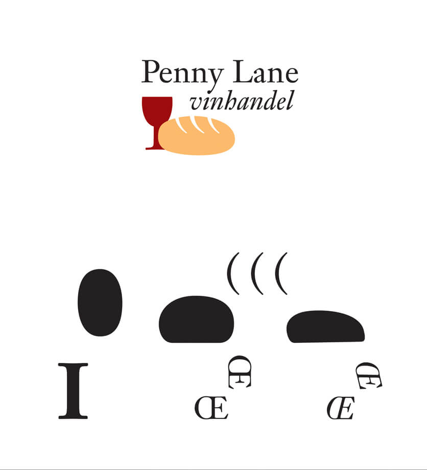
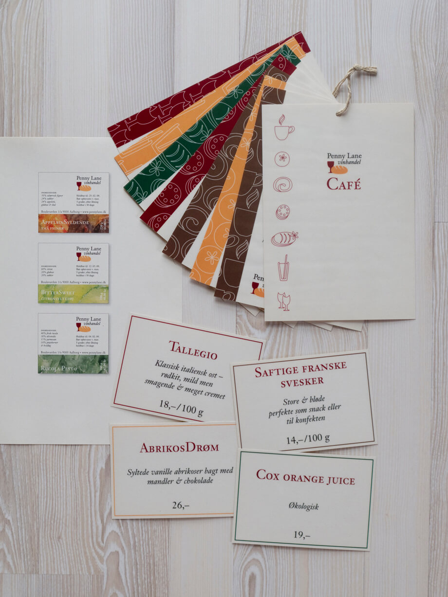
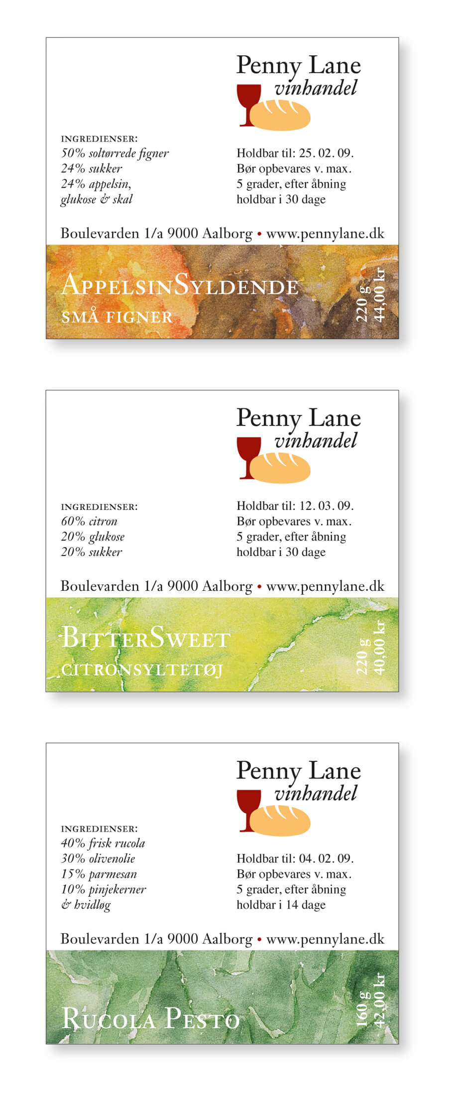
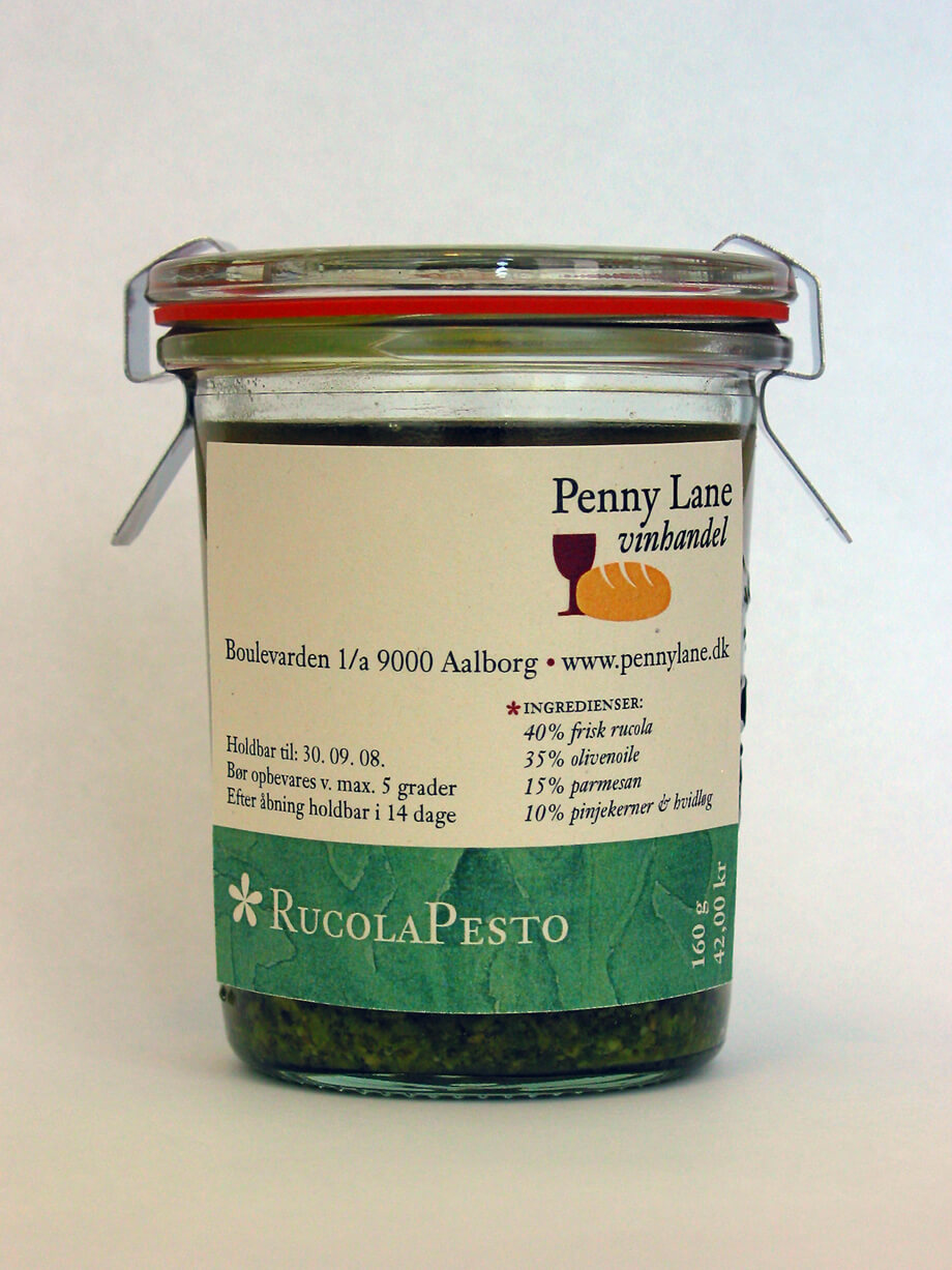
Penny Lane Vinhandel existed between 2005-2012 and was one of Aalborg’s most popular cafés. The name dates back to when the store was a wine shop. Penny Lane Vinhandel was a shop combined with a café and had a large in-house production of delicacies and pastries. Craftsmanship, quality, focus on the best ingredients and personality characterized the company.
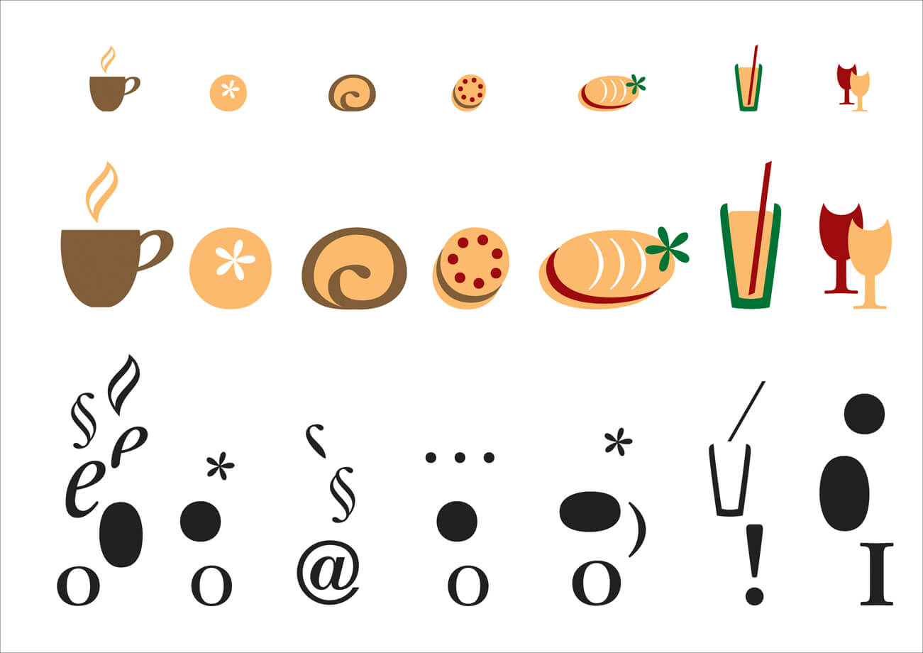
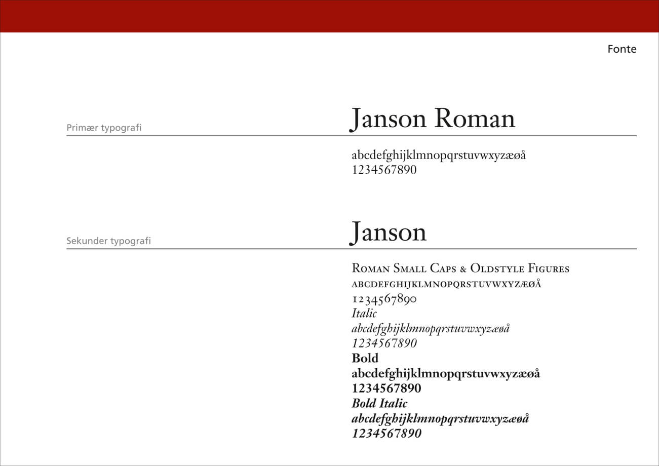
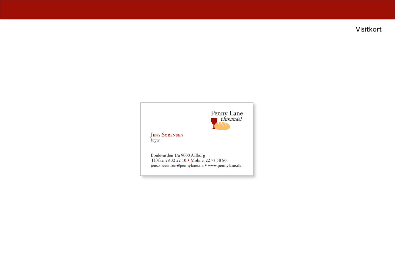
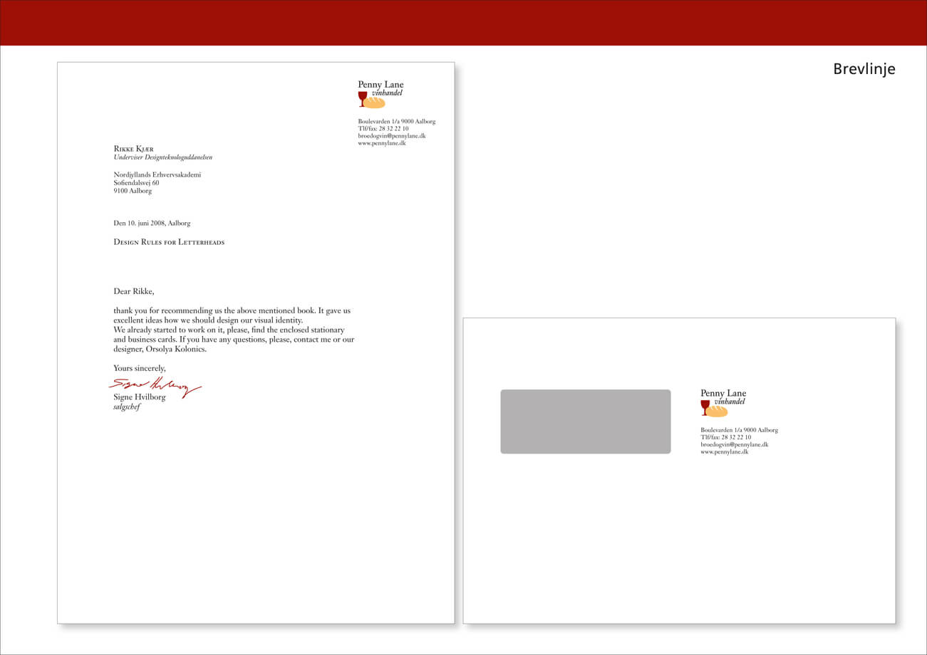
I chose Janson, a renaissance font that expresses quality, tradition and ballance. I used it not only to write texts, but also to build the logo as well as illustrations from the font’s clean and beautiful shapes. I practiced craftmanship digitally as I divided some letters into pieces and united them to wine bottle, bread, cake and more.