Honninghimlen (means “honey heaven” in Danish) is an online universe from women for women and about being a woman. It was my pleasure to design a logo primarily for the website and for the whole project.
I started by interviewing the two amazing ladies behind the concept: Dive into the dream, motivation and ambition that drives their project.
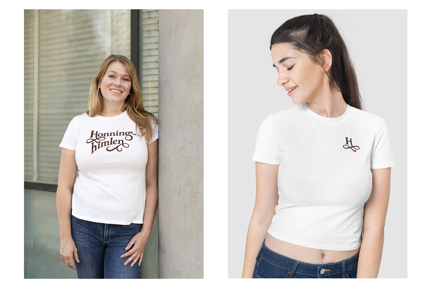
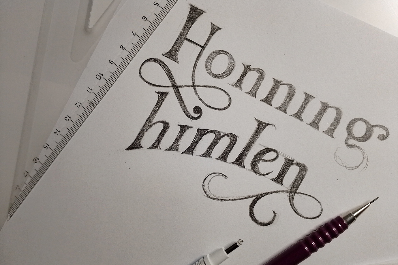
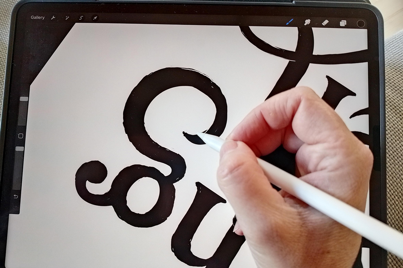
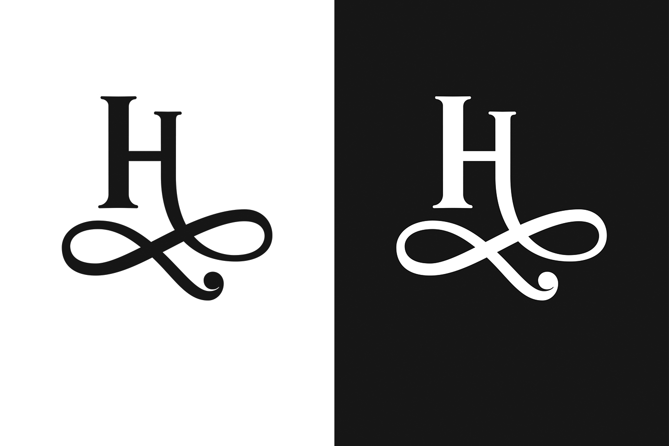
The brief emphasized the bee as a key element. However, I wanted to avoid creating an obvious and banal graphic of a bee. It is overused and used especially in connection with honey production and baby equipment, which was inappropriate here. Instead, I was seeking for a subtle and elegant reference. The flourish that growing from the letter “H” actually refers to the movement of a bee.
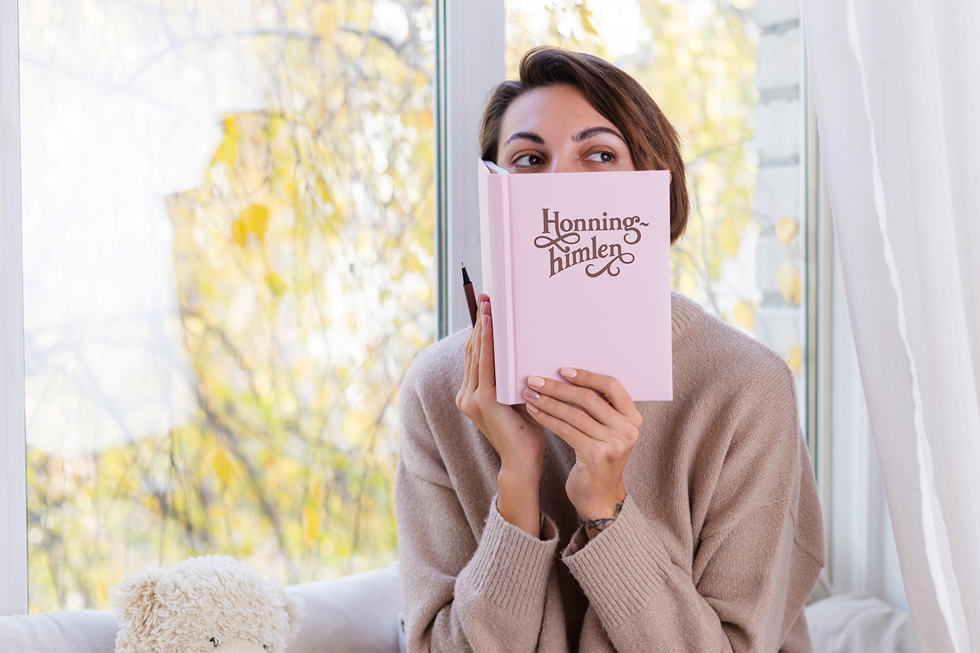
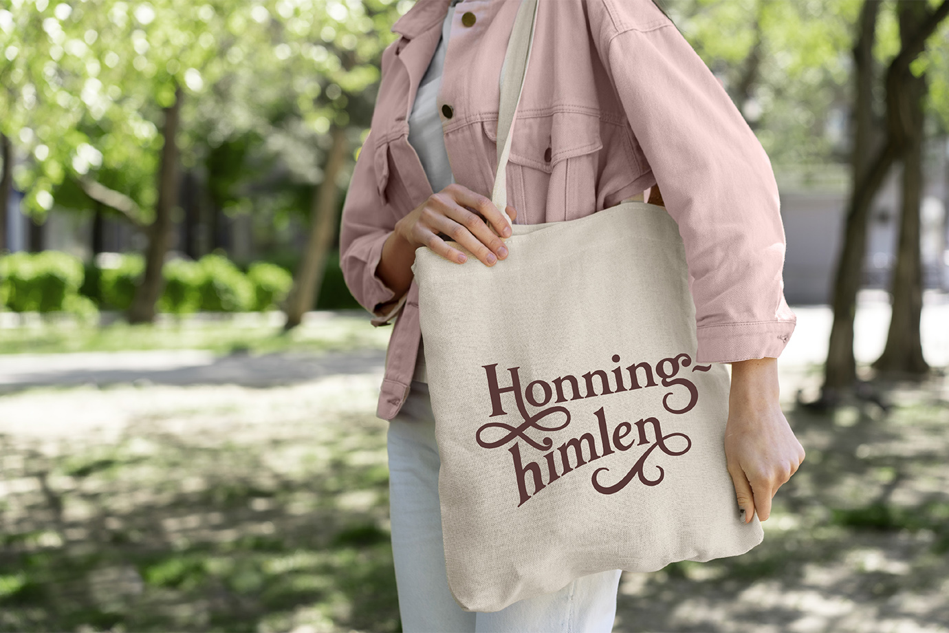
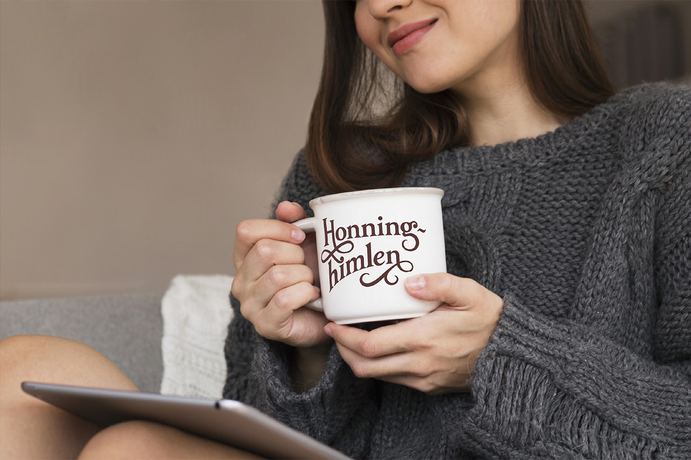
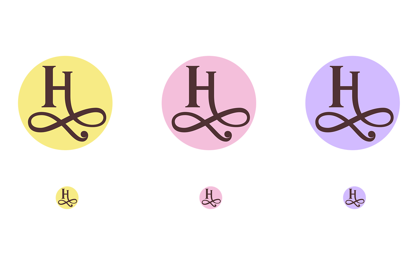
Even though the logo will primarily be used online, I could not help but create some mockups. Just to see if the logo could work on merchandise.